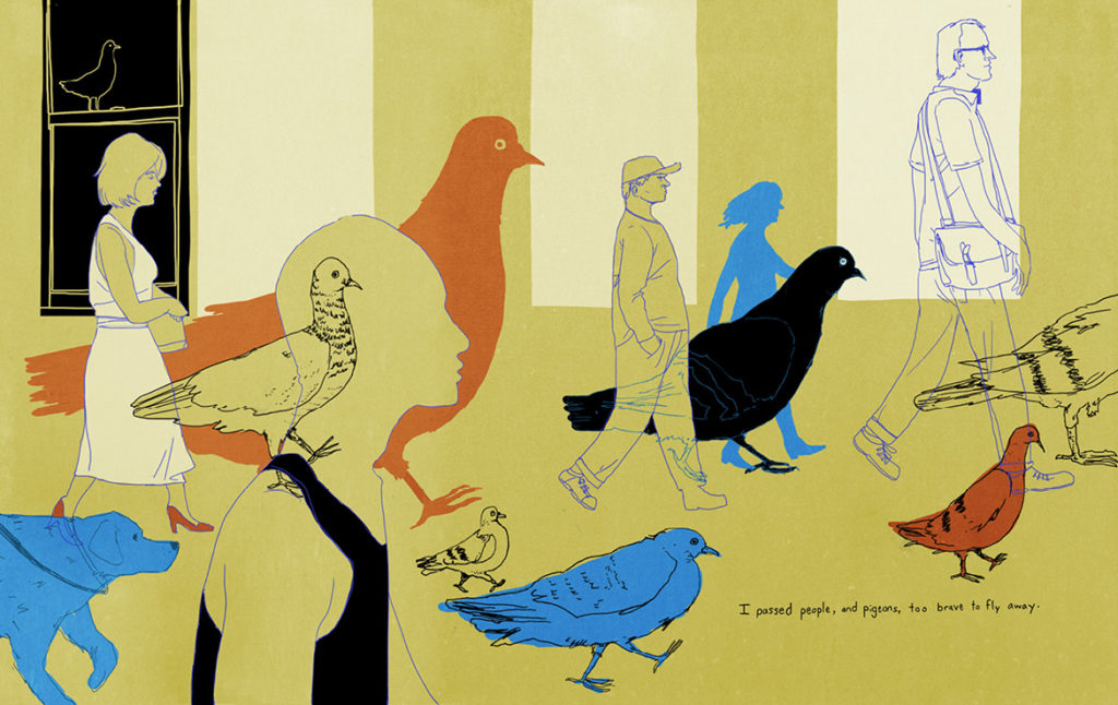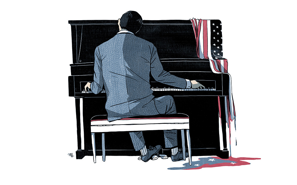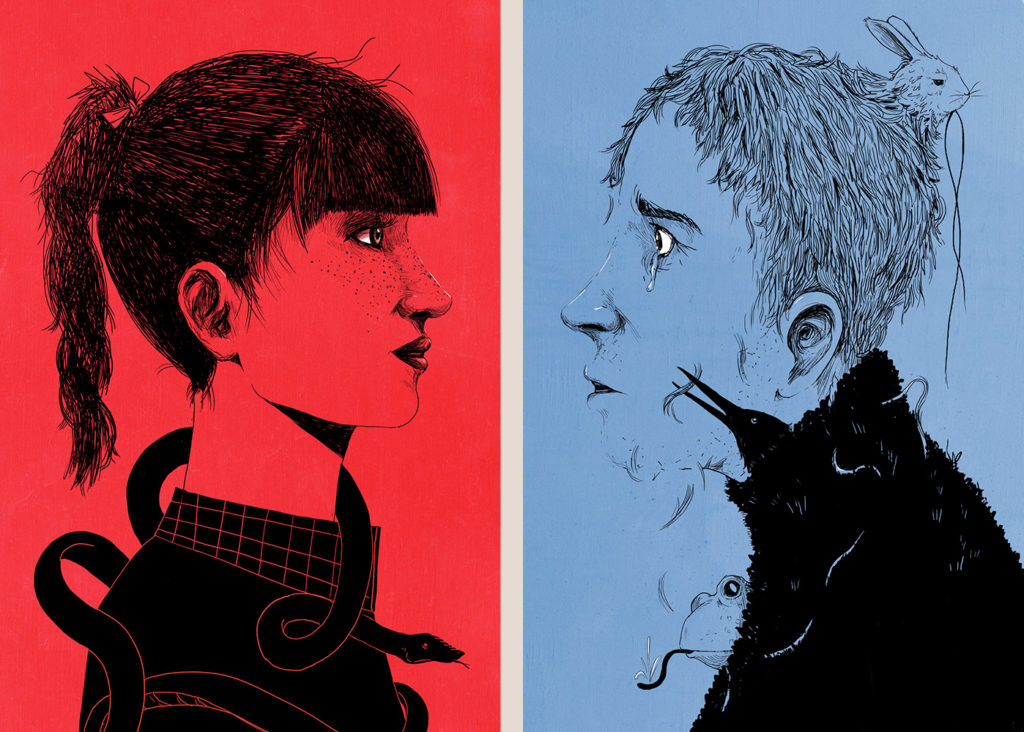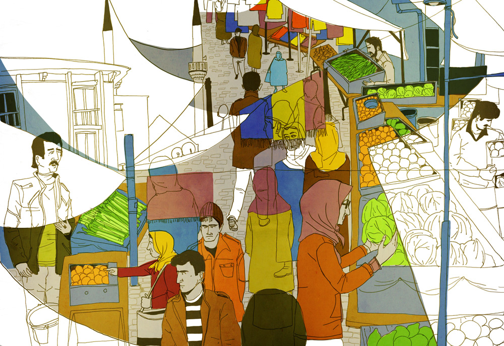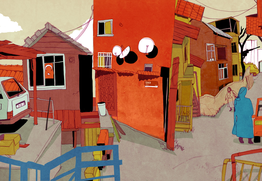
Professor Michael Hirshon was just featured in Magnifying, a series dedicated to showcasing the talent of our students, faculty, and staff to help you learn more about the remarkable individuals within our creative community here at the College of Fine Arts. Read the feature below:
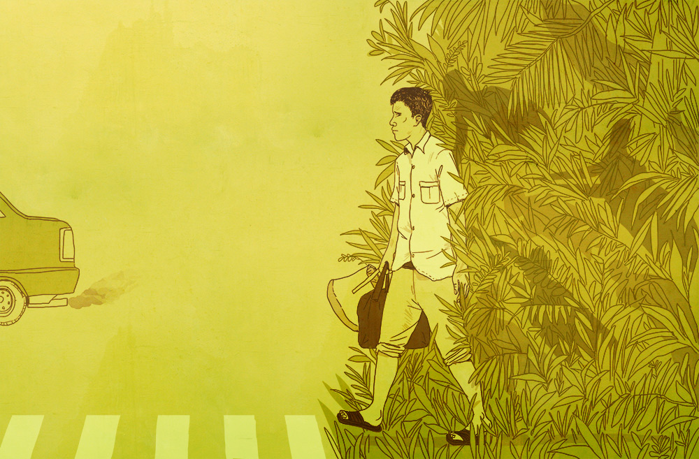
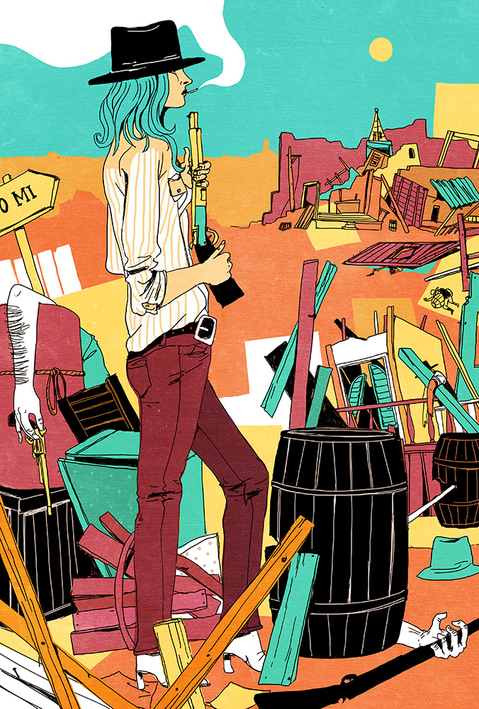
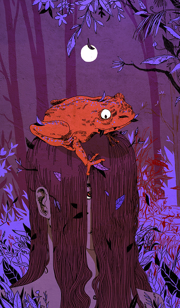
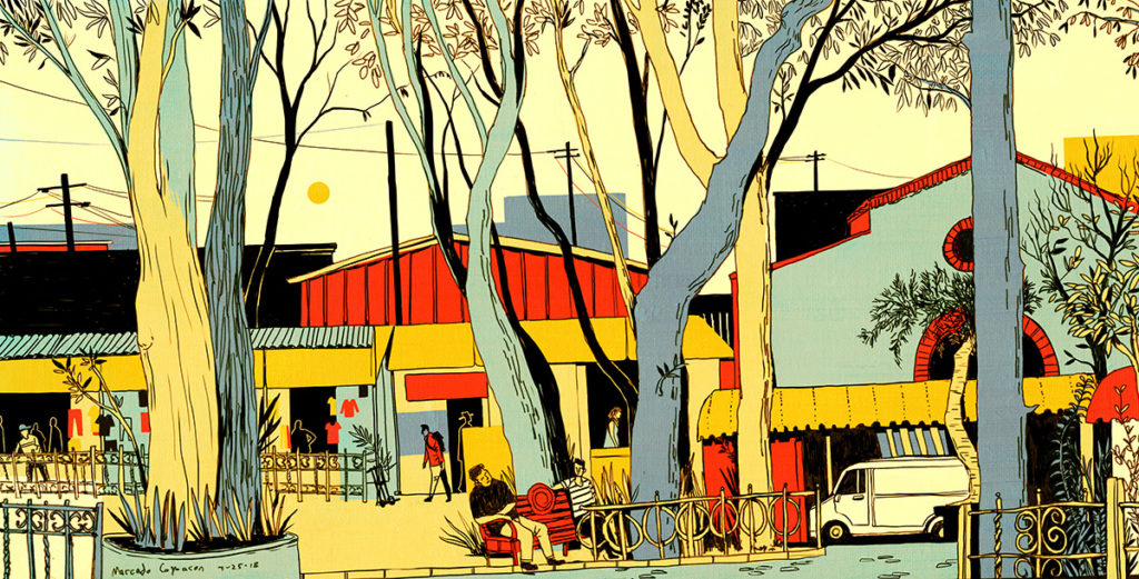
Michael Hirshon is a freelance illustrator and assistant professor of Illustration in the Department of Art & Art History. He holds a BFA in Visual Communication and Psychology from Washington University in St. Louis and an MFA in Illustration as Visual Essay from the School of Visual Arts in New York City. He has spent the past decade working with a wide array of clients including The New York Times, HarperCollins Publishers, Amazon, The Washington Post, Forbes, and American Express. His work has been recognized by the Society of Illustrators, American Illustration, Spectrum, CMYK, and 3×3.
Michael is enthusiastic about illustration and enjoys seeking out unusual avenues for visual storytelling. He has collaborated on packaging for a dog toy company, a taco truck chef’s cookbook, the side of a city bus, a dating coach’s graphic memoir, a US Senate campaign, and the walls of a daycare in Pakistan.
What do you consider your first big break in illustration?
My big break is kind of the equivalent of winning the illustration lottery. At the end of my senior year of college, I was very fortunately offered a huge project to illustrate a localized “We Accept American Express” sticker for the city of St. Louis. I’d put up a portfolio website, not expecting any kind of response until well after graduation…and now here I was, negotiating contracts and asking my professors about “kill fees” and “usage rights.” Legal jargon aside, it was a very positive experience and the perfect introduction to the process of collaborating with an art director. Best of all, the fee allowed me to support myself long enough to build a viable freelance business.
What is/was the process of building a network of freelance clients?
As an illustrator, I’m always trying to find the best ways to connect with the people who will actually commission work from me. In most cases, these people are art directors: an elusive group of designers who are very busy, and constantly being bombarded with self-promotional materials from thousands of incredibly talented illustrators. My strategy is to get these art directors to look at my website by sending them emails or postcards with work that I think will interest them. I’ve sent out thousands of postcards and tens of thousands of emails, and the 1-2% of people who have actually responded have become my client base. It’s an exhausting numbers game, for sure. But the most important part of building my network was making an effort to be flexible, versatile, and punctual. When it comes down to it, art directors like to work with people who are easy to work with, and if you can prove to be a consistent and productive collaborative partner, they will come back for more illustrations. Repeat clients now provide the majority of my work, and that allows me to focus more on drawing and less on sales.
What habits or rituals are essential to the success of your creative practice?
While it’s not really a habit or a ritual, my sketchbook is a foundation of my practice that touches every part of what I do. It’s where I process my ideas and experiences, for both client and personal work. When I flip through my old sketchbooks, I’m looking at a visual record of my creative development — a map of all the trends and habits in my work. Right now I’m working on a book where the art directors want me to treat each illustration as one of my sketchbook drawings, which has proven to be trickier than I’d thought. While it’s easy to make it stylistically similar, there’s no replacement for the lack of constraint or stakes that comes from actually working in a sketchbook. It’s important to have a place to make mistakes and try out awful ideas.
What will students in your illustration emphasis classes be focusing on?
The illustration emphasis is designed to expose students to a broad range of everything that illustration can be: books, editorial, advertisements, concept art, products, fashion, surfaces — you name it. My goal is that students come out of the program thinking like illustrators, confident in using their unique voices to tell any kind of story. There will be a lot of freedom for students both to explore, and to focus on specific interests by their final year. Students will be able to pursue more traditional pathways of illustration (magazine illustration, book covers, etc) or work with me to create their own path.
Can you tell us about one or two of your most unusual projects and how your approach may have differed because of the topic or format?
I worked on a series of illustrations for a now-defunct startup aimed at replacing members of Congress with a voting app (I’m guessing my art wasn’t the reason why the startup failed, but that’s an obviously biased opinion). They wanted illustrations that could be posted on social media: things like “I voted YES on Prop #999.” The tricky part is that they only wanted to pay for one illustration per issue, so I was designing images that could be interpreted as a YES or a NO depending on the accompanying text. It made for a really interesting challenge where I was analyzing peoples’ biases and viewpoints and creating images with enough ambiguity to be seen either way. For example: an image of a crowd of smiling citizens holding assault rifles, children included. Anti-gun people would see this image and focus on the ridiculousness of a child holding an assault rifle. Pro-gun people would see the image and focus on the happy expression of the people and see an ideal vision of society. The text does the heavy lifting. The assignment was an eye-opener for me, and changed my approach to future assignments. Interpretation is a tricky thing to navigate, but with enough knowledge of your audience, you can guide people’s understanding of your story.
Follow Michael’s work on Instagram at @michaelhirshon.

